Design.
Logo
Primary logo
Our logo is the foundation of our visual identity system. Though it stands on its own, the details help to tell our story and engage our audiences.

Knocked out logo
Against a dark background or photograph, use the knocked out logo.

Color
Primary colors
Vibrant. Hopeful. Diverse.
Our primary palette was created to feel bright and lively. Spanning a range of colors, it reflects the diverse individuals and partners who, together, form the CJP community.
VIOLET
Coated PMS 2593 C
Uncoated PMS 527 U
RGB 128 52 159
CMYK 54 87 0 0
HEX 80349F
GOLD
Coated PMS 2011 C
Uncoated PMS 130 U
RGB 255 153 10
CMYK 0 43 88 0
HEX FF990A
EGGSHELL
Coated PMS 2011 C (10% tint)
Uncoated PMS 130 U (10% tint)
RGB 253 245 232
CMYK 0 2 5 0
HEX FDF5E8
PERIWINKLE
Coated PMS 7452 C
Uncoated PMS 7452 U
RGB 146 145 255
CMYK 42 21 0 0
HEX 9291FF
CERULEAN
Coated PMS 2171 C
Uncoated PMS 2925 U
RGB 52 144 232
CMYK 88 20 0 0
HEX 3490E8
LIME
Coated PMS 2301 C
Uncoated PMS 390 U
RGB 114 155 35
CMYK 31 1 100 10
HEX 729B23
Secondary colors
Mature. Rich. Smart.
A collection of strong, rich colors, our secondary palette was created to contrast with the energy and vibrancy of our primary colors. Though darker and more mature, the palette still features the same warmth and range.
BLUEBERRY
Coated PMS 3506 C
Uncoated PMS 2175 U
RGB 29 99 174
CMYK 92 59 0 0
HEX 1D63AE
FOREST
Coated PMS 7477 C
Uncoated PMS 3165 U
RGB 0 68 69
CMYK 100 19 27 44
HEX 004544
CAYENNE
Coated PMS 7625 C
Uncoated PMS 2349 U
RGB 223 86 36
CMYK 0 81 77 3
HEX DF5624
PLUM
Coated PMS 7672 C
Uncoated PMS Medium Purple U
RGB 69 41 128
CMYK 90 100 0 0
HEX 452980
Tertiary colors
Neutrals.
Our tertiary color palette includes a range of neutrals that are intended for more functional use, such as body text.
DARK GREY
Coated PMS 2336 C
Uncoated PMS 440 U
RGB 66 66 56
CMYK 56 50 34 49
HEX 424238
LIGHT GREY
Coated PMS 408 C
Uncoated PMS 408 U
RGB 132 129 120
CMYK 31 30 19 9
HEX 848178
Type: for Adobe programs (InDesign, Photoshop, etc.)
Type hierarchy
Our typographic system is based on two typefaces: Recoleta and Soleil.

Headline 1
Recoleta Bold (sentence case)
Size to 60% larger than the body content

Headline 2
Recoleta Medium (sentence case)
Size to 30% larger than the body content

Subheadline
Soleil Extrabold SC all caps
Size to 15% larger than the body content

Body
Soleil Regular (sentence case)
Type: for Office programs (Word, PowerPoint, etc.)
Type hierarchy
Our Office typographic system is based on two typefaces: Palatino Linotype and Calibri.

Headline 1
Palatino linotype Bold (sentence case)
Size to 60% larger than the body content

Headline 2
Palatino Linotype Bold (sentence case)
Size to 30% larger than the body content

Subheadline
Calibri Bold all caps
Size to 15% larger than the body content

Body
Calibri Regular (sentence case)
Photos
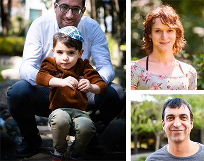
Portraiture I
Hopeful & Proud
- Warm, natural lighting
- Vibrant colors
- Expressions that convey empowerment and joy
- Photos can be candid or posed; posed photos should not feel overly staged or inauthentic — subjects can look at the camera or away from it
- Individuals should be shot from the chest up, occupying at least 70% of the frame
- If possible, pieces of individuality (clothing, gesture, accessory) should be emphasized
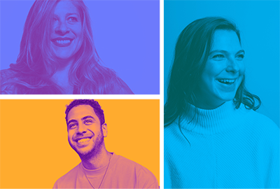
Portraiture II
Vibrant & energetic
- An extension of our portraiture direction, with a two-color treatment applied
- Individuals should be shot from the chest up, occupying at least 50% of the frame
- Plain, neutral-colored backgrounds (individuals may be clipped out and placed on a neutral color)
- Recommended for use in social media assets, specific events, campaigns, for received headshots, or as a background for type
How to create
- Bring photo into Photoshop; convert to black and white
- Add a gradient map adjustment layer; convert the colors within the gradient map to our brand colors (use contrasting colors for the best result)
- Adjust the levels, brightness, and contrast as needed
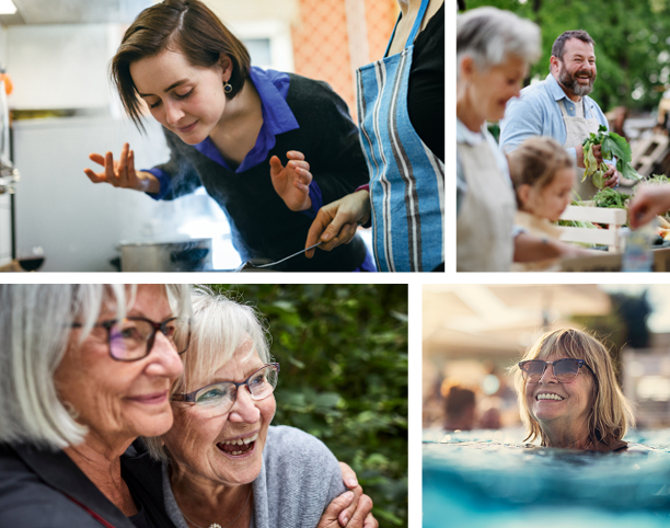
Lifestyle
Immersive & Personal
Lifestyle photos can show everyday interactions among friends and families, individuals engaging in Jewish culture, or our community in action.
- Candid, natural — not staged or posed
- Warm, natural lighting
- Immersive and up-close; viewers should feel as though they are placed in the moment
- Focus on moments of connection, discovery, and shared joy
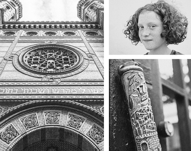
Our shared history
Thoughtful & reflective
Historical photos depict the important figures, locations, monuments, and artifacts that are part of the fabric of our shared story and culture.
- High-contrast, black and white treatment
- Can be a black and white photograph or a black and white treatment applied to a photograph
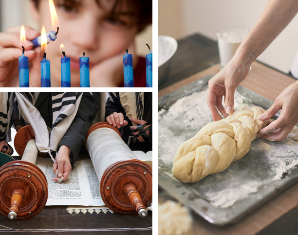
Jewish culture
Celebratory & bright
Cultural photos depict the religious and secular items that are important to our shared Jewish identity. Items are depicted within their context.
- Combination of macro and micro shots
- Warm, natural lighting with vibrant colors
- Used when discussing our work in art and culture, education, and global travel
Events and philanthropy
Alive & joyful
Event photos capture our community coming together at events both philanthropic and social.
- Warm, natural lighting with vibrant colors
- Focus on moments of connection and discovery
- Photos can be candid or posed, but should feel natural and authentic
- Photography can also highlight the philanthropic activity itself (food donations, building materials, etc.)

Approved images
Add life to your presentation or report.

